![]()
NARCCAP is an international program that serves the high resolution climate scenario needs of the United States, Canada, and northern Mexico, using regional climate model, coupled global climate model, and time-slice experiments. The NARCCAP Data Manager is Seth McGinnis, and the Executive Director is Linda Mearns. You can visit our website at http://narccap.ucar.edu.
My name is Josh Thompson, and I am a student assistant in NARCCAP. I am working on visualization and web support for the project. One of our goals is to integrate our data into Google Earth, which is what I am doing here.
Here are some examples of NARCCAP plots that have been overlayed into Google Earth.
You can download a sample KMZ file containing a handful of plots here .
In order to put an overlay of a plot into Google Earth, I had to start by generating the plot (I used NCL). The image that NCL produced was not usable in Google Earth, so I had to edit it first.
Below is a screenshot of an RCM+gcm pairing. Data is limited to the boundaries of whichever run you are viewing, so there will be different sized overlays. They are all overlayed onto the proper lat/lon coordinates, which you can see from the data and boundary lines that Google Earth creates. If you look at Hudson Bay in the example below, you will notice the dry area conforms to the outline of Hudson Bay's shoreline.

The code involved in a KMZ file for all NARCCAP data is very long. To get around having to do hours of work, I automated the process. As you will see in every plot displayed in Google Earth, there is a thin border around much of North America. This is a common boundary that I set to make the automation process much easier. With it, I can set every plot to one specific boundary, even if the data doesn't cover the entire area.
When doing this, all of the extra "white space" around the data needed to be set to transparent. To set the transparency, I used 'pstoimg' (the output from NCL is '.ps', and it needed to be changed to '.png'). There was also the area around the plot that was not needed. If that wasn't cropped out, the image would not overlay properly onto Earth. You can accomplish this using 'pstoimg' as well. With all of the options set, my command looked something like this: 'pstoimg *.ps -antialias -crop als -transparent -flip r90.' Antialias is used to sharpen the image, and '-flip r90' rotates the image from landscape to portrait (image would be sideways otherwise).

For plots that only have data over land, transparency will be set the same way as above. When the transparency is being set, it takes out all of the "white space." In this case, the "white space" includes areas within the data boundary that do not have data. That being said, none of our data will ever use the color white as a value holding color.

In the plot above, you can see how the data goes all the way to the edge in some areas (Greenland, for example). This may seem like it is cutting out some data, but it is not. I have set the boundary to be as large in each direction as the largest model boundary to avoid missing data.
After the image is done being processed, I have to make a KMZ (or KML) file. Having hundreds of plots can make this process very long, and possibly leave errors in the code that would be very difficult to find. Instead, I have automated the process using a Perl script. It reads in a file name (which I have formatted a specific way) and splits it into three objects; variable, model run, and time. With this information, I can have Perl automatically choose which color table to use and what to name the file. It then writes everything that a KMZ/KML file needs, along with the variables (such as file name and color table), to a '.kmz' file. After that is done, it is ready to be imported into Google Earth!
Having plots displayed in Google Earth has many benefits for us. With Google Earth, we can zoom in to a location, take a snapshot, and use that in a presentation or poster. This makes it much more efficient and flexible than trying to create many separate plots for different presentations. Also, unlike with NCL, you can have your data slightly transparent and turn on landmarks, boundaries, roads, and other things to help recognize specific areas within the data. The example below is showing data zoomed to Denver, with labels, roads, and boundaries on, and a placemark where the NCAR building is. Of course, the farther you zoom in, the more detailed the boundaries, labels, and roads will get.
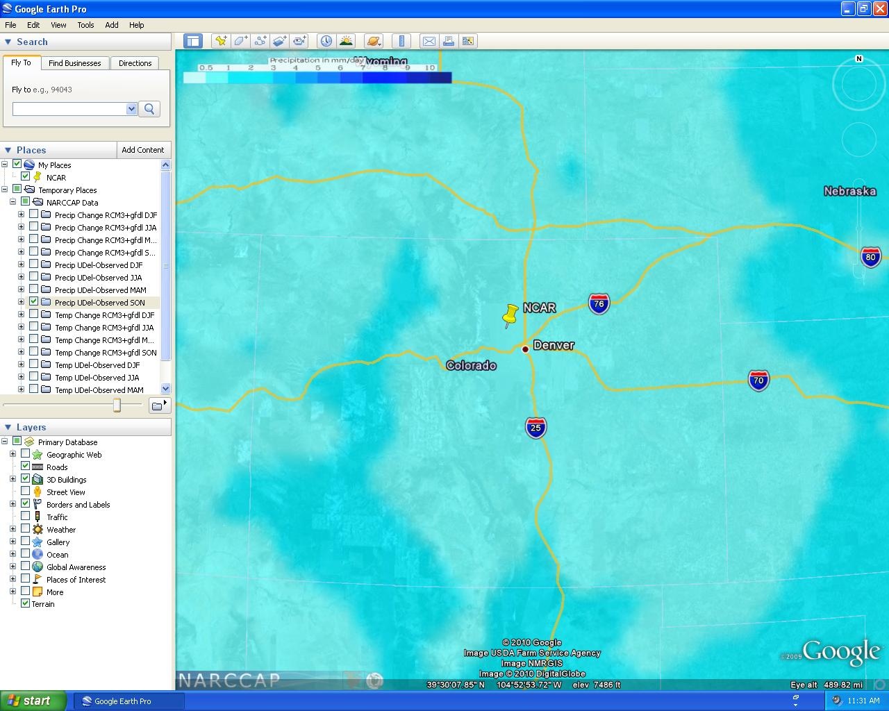
Using the zoom feature of Google Earth, you can find values for specific locations much easier. Each plot has a color table in the top-left corner of the screen to determine color values. As shown in the plot above, you can zoom to a desired location, set it next to the color table, and easily match the colors to find the value.
The images that are used in the KMZ file are stored remotely. This means that the images are download temporarily to be displayed in Google Earth, and may take a few seconds to appear. It is possible to use local images to do the same thing, but to keep downloads smaller and for ease of use, images will remain remote for the time being.